
Self-assessment of the previous assignments
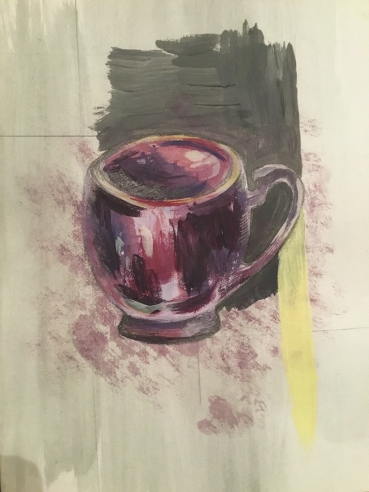
Part one: I used shadow and tone and developed my visual skills by observing the space between objects as well as the objects themselves. I experimented in my sketchbook with texture and collage. I learnt a lot about light and dark tones and their ability to make my work more realistic and 3D. I was really happy with my still life final drawing and used the skills I had learnt to place the objects successfully as a group.
Part two: This was my favourite part of the course. I think I was more experimental in my choices of media and composition. I tried to use interesting angles and foreshortening. The mixed media still life worked well and I like that I chose to leave some parts untouched. The monochrome exercise was more difficult and I repeated it which I think was an improvement because I used a greater variety of tones. I absolutely love the sketches of the dressing table both in fine liner pen and in ink and wash. I think the simplicity of line works particularly well. For the final piece I wanted to use an experimental angle and to zoom in on the clothes rail. The different fabrics gave me the chance to use a variety of media to show the textures.
Part three: This was definitely the most challenging part for me. I enjoyed drawing the trees but I found the landscapes so difficult. I think I found it hard to capture an atmosphere and to translate it onto paper. The buildings were better as I enjoy perspective, but again I found my work was a little rigid and I found it difficult to add my personality to the work. The drawing of the statue was my personal favourite from this part because of the more experimental angle and my choice of media. I think I managed to capture the atmosphere here. My final piece was again quite a struggle. I think I could have been a lot more experimental with the texture and maybe it would have worked better with brighter colours.
Part Four: I really enjoyed the figure and the head. I love figure drawing anyway but I had never drawn portraits before. I found that the quick studies really helped with a looser style of working. I loved the foreshortening exercise as I had to look at the proportions to get it right. Of the figure drawings I really like the mono prints. Because I had to draw straight onto the paper and there was no chance of corrections there was less control over the outcome. I learnt so much from the portrait drawings and also found that there was a great difference in outcome depending on the media used. The tonal study in pencil was great for picking out highlights and shadows on the face. The pastel on coloured paper meant I was more experimental with my use of colour and I loved that the drawings faded into the background and the looseness of line around the head.
Exploring Paris flea markets using line, mixed media & mono-print
Looking at the work of Nathan Ford, Colin Smith, Kari Terrell & Tracey Emin
The inspiration for this project came from my love of Paris flea markets. I knew I would be visiting Paris in April so I thought it would be a great opportunity to gather lots of information and photographs. As well as local street markets in Montmartre I went to Porte de Clignancourt and Marche Aux Puces. These are amazing markets which first began trading in 1885 and they are absolutely rich with inspiration and history. In their early days the markets were run by rag and bone men known as ‘pecheurs de lune’ or ‘fishermen for the moon’. I love the romanticism of the markets here and the fact that every time I visit there is a brand new source of inspiration with so many beautiful, unusual objects. I think that the history of antique objects adds to their story and one can imagine where they have come from or who has owned them in the past which gives them a kind of life of their own. I was thinking about this and about the programme which I watched in part four, John Berger’s ‘Ways of Seeing’ and it made me look at individual objects and wonder where they had been before. How had they been displayed and perceived by others? Now they are awaiting a new home and owner and so may be seen in a completely different light or have a completely new meaning to that person. I really like this idea.


Above are some fine liner sketches of objects I found. I have randomly placed them over the page to show the variety of things for sale. I love the fact that they are all so different. They are simply a collection of things that I picked out because they appealed to me aesthetically.
The influence of the work of Tracey Emin


Here I have made mono-prints in the style of Emin using simple line and black ink. I love the simplicity of her mono-prints and her use of basic lettering. Above I have linked the words I used to the flea markets. The second picture translates as ‘old is beautiful’ which reflects my love of antiques and the fact that I really like imperfection. I think it’s much more exciting to look at the imperfections in things and people as this is what gives them individuality and personality. I really want to reflect this in my own work. After drawing the mono-prints I pressed lightly in some areas to create dark patches adding to the imperfect, old impression. Below are some of Emin’s mono-prints that influenced me:


Emin’s prints can have quite a dark subject matter and are often sexual or feminist. This is often backed up by a message which is printed in capital letters with spaces in between. I think this gives an innocent, childlike effect which is in contrast to the subject matter. They are printed in black ink onto a plain white background and the main image is usually central. She creates the prints using single lines in a variety of thicknesses which I think adds a variation of tone. The shapes are basic and I think that she creates texture by the roughness of line which is quite jagged in places. In my opinion she has used the medium of mono print to show a simplified message. Thoughts can be recorded quickly and are easy to view and process. I think that had she used a different medium such as paint, the message may have been lost as there would have been other things to consider such as colour or texture. I also think that a lovely quality of mark making can be produced with mono print.
My work inspired by Colin Smith
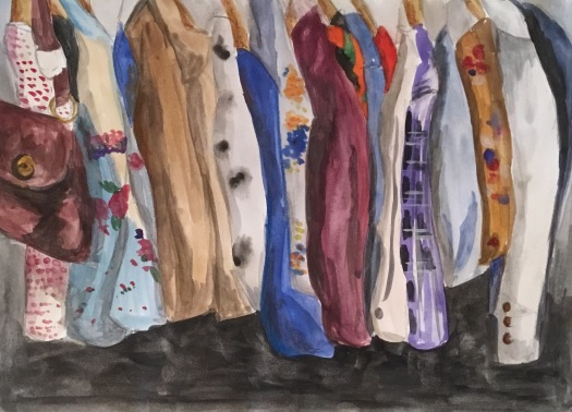
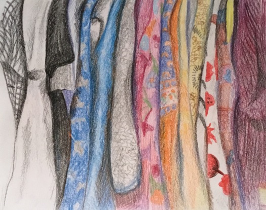
For this piece I have used water colour paint to recreate a photograph which I took in the flea market. I have done this in the style of Colin Smith by leaving the top of the rail out of the composition. Just as he does, I have made the lower part of the composition dark in order to show off the edges of the clothes as they hang down. I used light and shadow to show the overlapping of the garments which helps to add shape and form. When the base layers were dry I applied the different patterns on the fabrics which really brought the picture to life. The picture at the bottom was made using coloured pencil. It has quite a different effect to the first with the colour being less bold and more grainy. It was easier to control the pattern on the clothes as the pencil had a fine point and could make more detail.
Below is a painting by Colin Smith
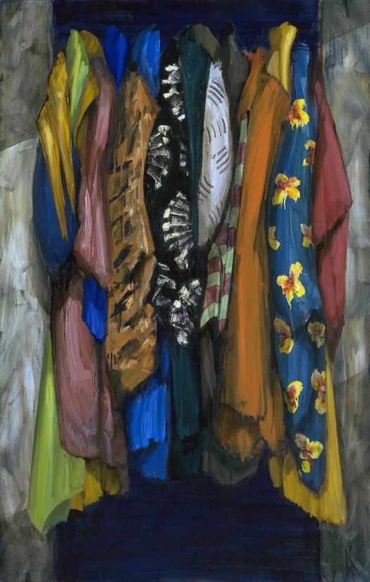
I discovered this artist on the Tate Instagram by chance and was immediately drawn to his work because it reminded me of my rail drawings from Part Two. I knew it would be great to look at because of the photos I had taken of vintage clothes. I was struck by the vibrant colours and how these worked with one another. The patterns on the clothes are really beautiful and varied and I love that the rows of clothes are regimented on the rail and yet have such an eclectic mix of colours and patterns together. I think this contrast is really effective. I love the use of light and shade on the fabric to show the folds and overlapping and I like that the top of the rail is not seen. The darkness at the bottom of the composition really shows off the delicate edges of all the fabrics as they hang down.
Smith uses bright, vibrant colours including primary and secondary with contrasting colours next to one another. I think these have been applied in quite a spontaneous manor because there appears to be surface texture. The textures of the different fabrics are shown by the brush strokes. The black background however seems very smooth in contrast. The shapes he has used are soft and realistic and the garments seem fluid and tactile, as though you could reach and touch them. The shapes of the folds help to create form. I love the patterns he uses in such a variety including stripes, flowers, squares, dots and semi-circles.
Nathan Ford
My work inspired by Nathan Ford
My first response was in pastel in blue and purple. It was a quick study and I feel it didn’t capture the beauty of the artists work. I wanted to experiment with the blocked in background colours and the pencil lines. I don’t think that pastel was the right medium to use as it is hard to get clean edges and accuracy. I then used acrylic paint for my second response and found this a much more suitable medium. The colours were easier to blend and I was able to make a wider variety of colours and tones.
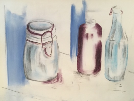
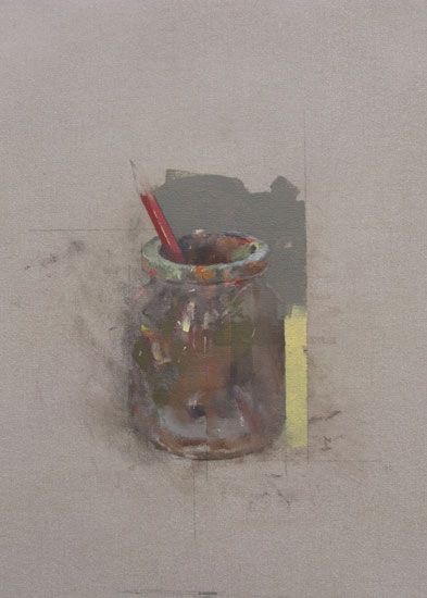
I think Ford’s work is absolutely beautiful. It links to my project because he paints everyday objects. What I love about his work are the plain, understated backgrounds as they push the objects forward. I also really like the areas of block colour that he places behind the objects, often leaving pencil lines in place. These lines help to move the eye around the work, taking the eye up into the negative space which I think is just as important as the object itself. He uses a limited colour palette and works with neutral and pastel colours. He uses large, textured brush strokes on the objects which I think show the reflections and different colours on the glass well. Also the colour he uses around the jar has been applied to look quite flat which is in contrast with the texture of the object. I think it is really lovely where the paint smudges on the left side of the jar so that it begins to disappear into the background. this contrasts strongly with the solid yellow paint line on the opposite side. There is a kind of mix between delicate and bold in his work and I really like this.
Kari Tirrell
Tirrell uses overlapping objects piled up. She often uses old toys and objects from the past. The colours are bright, bold and realistic. Generally the same type of objects are put together. Her work links to my project because the flea markets I visited were filled with boxes of random, old objects. The bright colours are eye catching and fun and the eye is drawn around the page from one object to another making the work really exciting. The objects are odd and imperfect which I love and they have lots of detail. Again the work has a contemporary look which will be a good contrast with the antique objects.


My response to Tirrell’s work
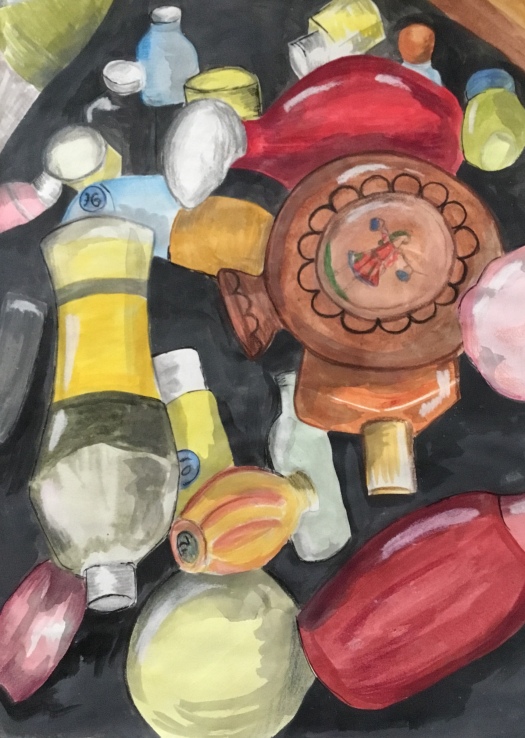
Using my photograph of perfume bottles from the flea market, I have worked with acrylic paint to give bold, bright colours. Coloured pencil on top adds shadow on the glass and white chalk adds reflections and highlights. The gaps between objects are dark, solid colour which makes them stand out more from the page.
Mono-prints of objects found at Flea markets


Cutlery in acrylic and mono-print


Mono-prints using a variety of backgrounds


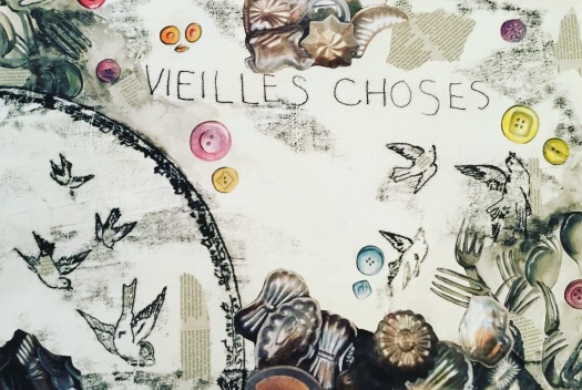
Below is a piece I made which mixed the monoprint words and objects with paintings of the cutlery and buttons. I added collage by ripping up some of my photographs. I was thinking of this being a final piece but I decided that it didn’t quite work, possibly because of the placement of objects and lettering. I put it to one side while I began my large final piece with the rail and then realised that it would be a good idea to combine the two. I decided to tear sections off and add them around the composition and I’m really happy with the result as it has lots of interesting parts scattered around the work.
Final Piece One – Triptych using acrylic


Final Piece Two – Ink drawing with mixed media

Final Piece Three – Mixed media with layers
Final piece following tutor feedback
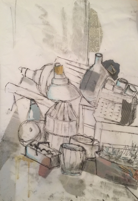
I decided to create a new piece of work which is influenced more by the delicate prints and ideas in my sketchbooks. I have chosen an arrangement of objects which were piled up outside a market stall and have mono printed directly onto white tissue paper. This really shows off fine lines and mark making. I have used loose, continuous line for much of the print which gives an organic, flowing feel. Underneath the tissue I have placed small pieces of collage including newspaper to give subtle colour and to add interest. Along the base of the print I have dripped yellow ink which I think adds to the vintage effect. With mono printing I really like the areas of the paper which inadvertently pick up soft tone, usually where the hand has mistakenly brushed the back of the drawing. I think these areas of tone add depth and warmth to an otherwise plain background. The colours underneath the tissue paper give the impression of all the different layers of objects which are piled together and gives depth to the work because the eye is being drawn further into the image. I am much happier with this piece because I think the free, simplicity of the delicate line works really well and I also feel it has captured the atmosphere of the flea market.
Artist’s statement
Exploring Paris flea markets using line, mixed media & mono-print
The starting point for this project was my trip to Paris where I knew I’d be visiting flea markets as they are one of my passions. I made notes on everything around me including the sounds and feelings as well as taking many photographs. I wanted images of unusual, plied up objects. I made sketches in my book.
Using this research I will build my personal project. I also plan to look at four artists in particular and link these into my work as it develops:
Tracey Emin will bring the lettering element to my work with mono-print. I want this to be simplistic and possibly to convey a message/connection to the work. I think this may be in black and white.
Nathan Ford will help me to look closely at the individual objects I saw and put a modern twist on the old things that I found. I will look at his use of negative space in particular. I think this could work well alongside the style of Emin.
Kari Tirrell will be a very useful artist because her work looks closely at how objects are piled up together.
Colin Smith should be inspiring if I decide to work on the antique fashion and jewellery. I really love the pattern work on his paintings.
There was such a variety of antiques to look at so I had to think about compositions and how objects sit together on tables or on the floor. I wanted to explore with mono-print, not just with lettering but with objects too. I’d like to include collage as part of the mixed media as I think it will be a good way to show the eclectic mix of things.
Working in two different sketchbooks I looked at mono-printing, trying out different objects and compositions and printing on to a variety of surfaces. I made ink and brush drawings and used Brusho inks to bring a zing of colour. I worked a lot on tissue paper as I really like the texture that is created as the ink is thick and the paper so delicate. The little creases added interest. I found that certain objects worked better than others and had particular success with the cutlery and the plates with birds. I experimented with collage, adding different backgrounds and mixed with the printing. I made line drawings of shoes and birds and mixed these up with a variety of French words and phrases. I had to practice the lettering a lot as it had to be written backwards onto the printing plate so I discovered the way to solve this was to write onto tracing paper first and then flip it to print. All this experimentation was to help me decide on the content and composition of my final pieces.
For the triptych final piece I began with the painting of cutlery. I used acrylic and I made some small areas textured and 3D by adding tissue paper underneath. I used grey colours and tones but also decided to add some areas of yellow ochre in the background which I think adds warmth. I like the fact that the cutlery in the background fades gently into the canvas. White acrylic was used to show the shine of the metal. For the other two parts of the triptych I also used the tissue paper to create raised areas which helps to link the three pieces together. I wanted to show the buttons off because they are so bright and colourful and I like the repetitive circular shapes. I liked how they appeared in the earlier sketchbook mono-prints and thought that they would look great if brought to life in colour. For the clothes I zoomed in on the rail and used bright, bold colour to make it eye catching. I think the contrasting blue and yellow look particularly good next to each other. I was then able to add pattern on top. The tissue paper became like folds in the fabric showing lots of texture. As a triptych I placed the grey tones of the cutlery in the centre with the bright colours either side. I think the choice of three different types of objects work well together and are a good representation of the things I saw.
For the next piece I chose to work on a large scale. I wanted it to be predominantly a line drawing so I used ink and brush straight onto the paper. Using Colin Smith for inspiration I added bright colours and patterns onto the clothes. I used Brusho inks because of their high pigmentation. They are also great for sprinkling onto wet areas as the colours bleed beautifully into one another. Below the rail, the objects from the markets are smaller in scale, almost like dolls house furniture. I picked out small areas here in Brusho colour to move the eye around the piece. For the collage I ripped up a previous piece of work which I felt hadn’t quite worked and added it in areas around the piece. Images of birds from the antique plates were printed and are scattered around with one at the top holding a label in its beak. The labels were mono-printed onto fabric using French words relating to antiques and in the style of Tracey Emin. I wanted these to appear to be clothing labels. I think this piece works because of the diversity of line and shape and the different textures add interest and fun.
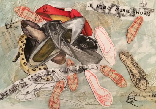
For the third piece I began with the idea of things being piled up and drew upon my research into the work of Kari Tirrell. I made a drawing of a pile of shoes which I had seen at the market and used a selection of media to colour them. Tonal pencil, oil pastel, charcoal, coloured pencil, acrylic and watercolour gave a variety of finishes. The background has tissue paper and an antique turquoise colour painted on which I rubbed over with a gold oil pastel to pick out the texture. I also collaged on pieces of sheet music. In my sketchbook I really liked how the shoe mono-prints turned out so I knew I wanted to incorporate these. I decided to print in black and red and to make them more 3D by sticking them to cardboard before attaching them to the piece. Again I have played with scale and the monoprint shoes are much smaller. The influence of Tracey Emin is added by the use of lettering which links to the theme. Finally I added images of birds which were decorating the antique plates I had seen. I drew these, then photocopied onto acetate making them transparent before adding to my work. I feel these bring a sense of delicacy to the overall piece which is otherwise quite bold.
I feel I have created three very different pieces and I used a wide variety of mediums. I have learnt that it’s ok to use a piece that doesn’t quite work and add parts of it that do to a new piece. Sometimes things don’t work out the way you expect and part of the learning curve is to see how you can re-work things to make them better. With the mono-printing I discovered that using less ink was much more successful as it created finer lines which were especially good for the lettering. Experimenting with different background papers and fabrics is really helpful and can change the appearance of the print. I found that the placement of lettering on the composition can make or break a piece of work; placed wrongly it can look awkward and unbalanced. With mixed media you have to be experimental and rearrange the different components and mediums until they sit well together. I have learnt though my painting of cutlery that acrylics can be delicate and you can create bold and fine detail. I added shadow onto the objects using contrasting colours. For example with the orange buttons I added blue to create the darker shade which is much more subtle than using black. Oil pastel can be tricky! The metallic ones that I used on one of the shoes in my final piece was too soft and I found it quite difficult to blend the darker tones. I hope that as well as representing the kind of objects that I saw in Paris, I have managed to capture a feeling of sentimentality and an element of fun. I would hope that when looking at my work one would get a sense of the diversity of the markets and I think I have shown antiques and ‘vieilles choses’ in a contemporary way.
Bibliography
The art of Tracey Emin
Thames & Hudson, 2002
Printmaking and mixed media
Dorit Elisha
Interweave Press LLC 2009
